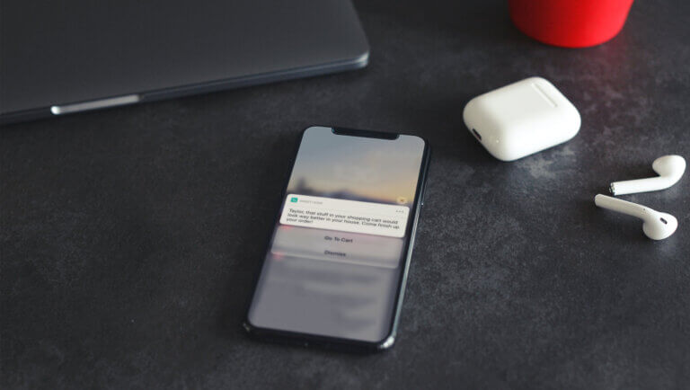
Overcome the 4 Most Common Fears About Interactive Notifications
Interactive notifications are a fantastic yet underused opportunity to drive engagement with your most devoted customers. Many marketers may not be familiar with all the potential use cases for them, or may not even feel like they’ve fully wrapped their heads around them and how they work yet. But it’s easier than you might think.
Here are several examples of different types of Android interactive notifications.
Think interactive notifications won’t work for your app? Think again. Below we will go through some common fears about interactive notifications, and then discuss the ways we can help make these fears disappear.
“It’s Unfamiliar”
Interactive notifications may at first feel like unfamiliar territory, but they really shouldn’t. As a marketer, you’re already quite accustomed to sending your audience messages or CTAs in the form of push notifications and emails, or creating web pages with embedded CTAs. Push notifications themselves are a kind of a CTA. Combining button CTAs within a push notification (as you do in an interactive notification) is only a minor shift.
Just as you write a CTA for a push notification, you would do the same for an interactive notification. You still want to be clear and concise to get the user to execute on the action of your choice and direct them to where they want to go. The only difference is that you’re giving users different options or a choice, so clarity is even more important.
For example:
-
An airline could send a notification that says “It’s almost time for your trip, would you like to check in now?” and give the user the option to respond with “Yes” or “Remind me Later” buttons.
-
A department store could send a message that says “Take 20% off items in your shopping cart when you buy by Friday!” giving users the options to either “Buy Now” or “Remind Me Later.”
-
A news app could send a user a message about a developing story of an 1800s ship discovered off the shore of Virginia, giving readers the option to “Follow” or “Share” the story.
“It Seems Technical or Too Hard to Implement”
Beginners to interactive notifications may view them as something that requires a full development team to to add to your app, but this couldn’t be further from the truth (they work out-of-the-box when you use our own Engage).
Not only are they easy to implement, but interactive notifications can be a great way to capture user preferences to send more targeted messages to your users. Marketers might think, “I don’t have user preference information so I don’t know how to send more targeted email,” but interactive notifications are a good way to generate more user preference data so you can then develop more targeted messaging that will lead to higher engagement rates. For example, in the Engage UI you can configure an “Opt-in” button and set a tag you can use to target users with special offers (or other campaigns).
“The Use Cases Don’t Work With My App Strategy”
Some apps clearly have features and functionality that lend themselves well to buttons. But what if your app is more informational? Even in this case, there are times when you just want to reach out to your users with a question or an offer. What if you could identify and engage your most valuable users to drive even more value? Interactive notification buttons are a great way to identify these users while allowing you to tag their actions and preferences, making for better retargeting.
Setting up an interactive notification is a great way to reach out and also get back essential information that separates your best users from the rest. Once you discover who your highest value users are, you can offer them even more, while learning from them at the same time.
As part of the notification set-up, be sure to set tags and capture user actions. Anytime a user clicks on a button you can set a tag to capture that. These become highly valuable user preferences you can use for follow on segmentation.
“But I Want to Keep Users in My App”
You can do that with notification buttons too! You have a choice of executing an action in the background or driving users into your app. For example, if you’re a retailer you can send users an offer for an item via interactive notification with an “Add” button that allows the user to save the item to their cart, as well as one that says “Add and View Cart,” that adds the item then directs the user into your app. Some of the best use cases provide shortcuts or fast paths to send users to the exact place in your app where they want to go.
A sampling of interactive notifications real brands use to save users time:
-
Twitter: “Like” or “Retweet’ from the notification
-
Gmail’s Inbox app: “Snooze” or “Dismiss” a new email
-
Breaking News app: Engage with a news story (reactions like “Whoa!”)
-
LinkedIn: LinkedIn used to allow users to accept an invitation to connect right from a notification, but they have since removed this capability. This was a loss of functionality for the user, which is a real shame.
All of these examples provide your users with shortcuts or fast paths to useful functionality — and they will thank you with increased loyalty. Each of the actions described also provide you with extremely strong engagement metrics, and they are all measurable with both Urban Airship Engage and Urban Airship Insight. When someone interacts with your notification (even if they don’t go into the app) this is a very strong engagement metric. You’re providing them with utility. You could even set a tag with Urban Airship and do a follow-up notification with people if they don’t go into the app in the next few days.
You don’t have to lead people out of your app and risk losing that engagement. For example, instead of removing the true utilitarian functionality from their notifications, LinkedIn could have built a notification that accepted the connection request and then sent the user into the app. That use case would have provided utility and driven in-app engagement at the same time.
Don’t Be Afraid to Add Utility for Your Users — We Can Help!
One of the biggest reasons to embrace interactive notifications without fear? Users will think of the best notifications as a feature of your app, elevating your brand’s worth in their eyes, and increasing the chances of making your app part of their daily lives.
Whether you’re delivering valuable content to users, informing them, anticipating their needs or involving them in a conversation, notification buttons let you record their response and feedback and offer them value all at the same time.
Some people might think you need to be a large company like LinkedIn with a lot of resources in order to support this level of rich functionality, but almost all that we’ve discussed is available out-of-the box from Urban Airship.
Are you ready to start sending your own interactive notifications? If you’re a customer, check out the docs. If you’re not yet, sign up for our Engage product (there’s even a free version!) and get started today.
Subscribe for updates
If the form doesn't render correctly, kindly disable the ad blocker on your browser and refresh the page.
Related Posts


15 Mobile Insights You Can’t Miss from SXSW 2016
